ReKids
ReKids

A Case Study of ReKids, a Sustainable Platform for Buying and Selling Second-Hand Children’s Clothing
ReKids
Project overview
The product:
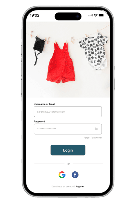
This project involves the design of a mobile application for buying and selling second-hand children’s clothing.
The solution is aimed at parents and caregivers of children aged 0–16, enabling them to give new life to clothes that are no longer used and to find quality items at affordable prices in a safe, sustainable, and intuitive way.
The product:
This project involves the design of a mobile application for buying and selling second-hand children’s clothing.
The solution is aimed at parents and caregivers of children aged 0–16, enabling them to give new life to clothes that are no longer used and to find quality items at affordable prices in a safe, sustainable, and intuitive way.
Project duration:
August 14th to October 27th, 2025 (12 weeks)
The problem:
Children grow quickly, which leads to an easy accumulation of “unused” clothing at home, often still in good condition but no longer needed. Over time, this reality also results in a significant financial expense on items that are only used temporarily, making it difficult for parents to manage their budget, household space, and make more sustainable choices.
The problem:
With busy routines, users often forget to care for their plants consistently. Without accessible guidance on watering frequency and plant needs, many end up losing their plants or feeling frustrated with the process.
The goal:
Develop a mobile application that enables users to buy and sell children’s clothing in a simple, safe, and sustainable way.
The solution aims to help parents save money, reduce waste, and find suitable clothing for their children through trusted tools (seller ratings, condition tags, and detailed photos), personalized recommendations, and environmental impact indicators.
The goal:
o develop a mobile application that enables users to buy and sell children’s clothing in a simple, safe, and sustainable way.
The solution aims to help parents save money, reduce waste, and find suitable clothing for their children through trusted tools (seller ratings, condition tags, and detailed photos), personalized recommendations, and environmental impact indicators.
The problem:
With busy routines, users often forget to care for their plants consistently. Without accessible guidance on watering frequency and plant needs, many end up losing their plants or feeling frustrated with the process.
User research: summary
I conducted interviews with parents from my family and social circle. Initially, I assumed their main concern was freeing up space at home by selling unused clothes.
Research revealed broader needs: children grow quickly, making clothing a recurring expense, and parents value sustainability and saving money by giving clothes a second life. These insights helped create a persona reflecting both the frustration of accumulating unused clothes and the motivation to adopt practical, accessible, and eco-friendly solutions.
My role: UX/UI Designer
Responsibilities:
•Conducting user research and defining target users;
•Creating user flows and wireframes for both mobile and web;
•Designing high-fidelity screens and interactive prototypes;
•Implementing design systems, typography, and color schemes;
•Writing and structuring the UX case study;
Gathering feedback and iterating on designs.
My role: UX/UI Designer
Responsibilities:
•User research and target audience definition;
•Creation of user flows and wireframes;
•Design of high-fidelity screens and prototypes;
•Development of the design system (colors, typography, icons);
•Feedback gathering and design iteration.
My role: UX/UI Designer
Responsibilities:
•User research and target audience definition;
•Creation of user flows and wireframes;
•Design of high-fidelity screens and prototypes;
•Development of the design system (colors, typography, icons);
•Feedback gathering and design iteration.
User research: summary
User research: summary
I conducted interviews with parents from my family and social circle. Initially, I assumed their main concern was freeing up space at home by selling unused clothes.
Research revealed broader needs: children grow quickly, making clothing a recurring expense, and parents value sustainability and saving money by giving clothes a second life. These insights helped create a persona reflecting both the frustration of accumulating unused clothes and the motivation to adopt practical, accessible, and eco-friendly solutions.
User research: pain points
User research:
pain points


Persona: Fernanda
Persona: Fernanda
Problem statement:
Fernanda is a 36-year-old mother of two and shop assistant from Guimarães who needs an easy way to sell and buy children’s clothes because her kids outgrow them quickly, leaving her with unused clothes that take up space and increase expenses.

User journey map
User journey map
Goal:
Free up space at home by avoiding the accumulation of unused clothers.
Goal:
Free up space at home by avoiding the accumulation of unused clothers.

Sitemap
Sitemap

Paper wireframes
Paper wireframes

Digital wireframe
Digital wireframe

Low-fidelity prototype
Low-fidelity prototype
Low-fidelity prototype
Based on the user flow, paper sketches, and digital wireframes, I created low-fidelity prototypes to test the app’s initial functionality and usability.
Based on the user flow, paper sketches, and digital wireframes, I created low-fidelity prototypes to test the app’s initial functionality and usability.


Usability study: parameters

Study Type:
Study Type:
Unmoderated usability study

Participants:
Participants:
5 participants

Location:
Location:
Vila Real, Portugal

Lenght:
Lenght:
8-10 min
Usability study:
parameters
Study Type:
Unmoderated usability study
Participants:
5 participants
Location:
Vila Real, Portugal
Lenght:
8-10 min
Mockups


Based on the insights from the usability studies, I applied design changes such as adding a “save as draft” option, improving the clarity of the tab bar navigation, and creating a more engaging experience by introducing community-focused features.
Before usability study
After usability study


Before usability study
After usability study


Before usability study
After usability study
Usability study: findings
Now that I have gathered the key insights from the usability study, here are the main findings and the real problems that a designer can solve.
1
Users noticed that, although the app allowed saving a listing as a draft, there was no clear place to view or access those drafts. This made the process confusing, and many users felt frustrated because they couldn’t easily find or continue the listings they had started.
2
Users expressed interest in interacting with other parents, but there was no community feature available. Without a space to ask questions, share tips, or exchange experiences, the app felt less engaging and less supportive.
3
Some users had difficulty understanding where they were in the tab bar, due to weak visual differentiation between active and inactive icons.
Usability study:
findings
1
Users noticed that, although the app allowed saving a listing as a draft, there was no clear place to view or access those drafts. This made the process confusing, and many users felt frustrated because they couldn’t easily find or continue the listings they had started.
2
Users expressed interest in interacting with other parents, but there was no community feature available. Without a space to ask questions, share tips, or exchange experiences, the app felt less engaging and less supportive.
3
Some users had difficulty understanding where they were in the tab bar, due to weak visual differentiation between active and inactive icons.
Now that I have gathered the key insights from the usability study, here are the main findings and the real problems that a designer can solve.
Mockups
Based on the insights from the usability studies, I applied design changes such as adding a “save as draft” option, improving the clarity of the tab bar navigation, and creating a more engaging experience by introducing community-focused features.
Before usability study
After usability study
Mockups
After usability study
Before usability study
After usability study
Before usability study
After usability study
Before usability study
Before usability study
After usability study
Before usability study
After usability study
Before usability study
After usability study
Based on the insights from the usability studies, I applied design changes such as adding a “save as draft” option, improving the clarity of the tab bar navigation, and creating a more engaging experience by introducing community-focused features.
Before usability study
After usability study
Before usability study
After usability study
High-fidelity prototype

Accessibility
considerations
1
The colour palette was designed to meet WCAG AA contrast standards, ensuring sufficient contrast between text, icons, and backgrounds for better readability.
2
A clear visual hierarchy was implemented across the app, helping users easily distinguish between plant information, care tips, and primary actions such as reminders and adding new plants.
3
Plant care information was structured using short texts, icons, and spacing to improve readability and reduce cognitive load, making the content easier to scan and understand.
Accessibility considerations
1
When defining the ReKids color palette, I ensured that the primary colors met WCAG AA contrast standards, providing good readability across different screens.
2
I use only two typefaces to keep the interface simple and consistent: one for headings and another for body text. Avoiding too many fonts helps the app feel clean and visually organized.
3
I implemented a clear text hierarchy throughout the app. This helps users easily distinguish sections, categories, and important information, making navigation more intuitive.
Takeaways
Takeaways
Impact:
In the ReKids project, I aimed to address common challenges faced by parents, such as managing clothes that children quickly outgrow, ongoing expenses on children’s clothing, and concerns about sustainability. Through the development of the app and user research, I gained insight into how the user experience can influence not only the ease of buying and selling but also trust, motivation, and the feeling of contributing to a positive cause.
Features such as environmental impact indicators, personalized recommendations, and trust-building tools enhance an experience that turns everyday tasks into more conscious and rewarding decisions.
What I Learned:
Developing the ReKids app taught me several important lessons about UX and product design, including:
Understanding user needs: identifying the specific challenges parents face when managing children’s clothing and creating solutions that simplify the buying and selling process.
Importance of simplicity: features such as the smart catalog and recommendation system were designed to make the process intuitive and efficient.
Accessibility considerations: ensuring that all parents can easily interact with the app, regardless of their technical proficiency.
Implementing user feedback: using parents’ input to improve the experience, from clear clothing condition labels to navigation within the community space.
Information management: presenting details about clothing, environmental impact, and reviews in an organized way, avoiding overwhelming users.
This experience reinforced the importance of creating solutions that balance simplicity, trust, and positive impact, allowing parents to save money, recycle, and feel part of a sustainable community.
Next steps
1
Obtain UX/UI feedback from experienced designers: share the ReKids prototype with more experienced designers to gather insights that can enhance the user experience and interface.
2
Document and implement feedback: organize all received suggestions and apply design improvements to make the app more intuitive, reliable, and enjoyable for parents.
3
Validate through usability testing: conduct tests with users in real-life scenarios to ensure that the features meet their needs in a practical, safe, and sustainable way.
Next steps
1
Obtain UX/UI feedback from experienced designers: share the ReKids prototype with more experienced designers to gather insights that can enhance the user experience and interface.
2
Document and implement feedback: organize all received suggestions and apply design improvements to make the app more intuitive, reliable, and enjoyable for parents.
3
Validate through usability testing: conduct tests with users in real-life scenarios to ensure that the features meet their needs in a practical, safe, and sustainable way.
Project overview
The product:
This project involves the design of a mobile application for buying and selling second-hand children’s clothing.
The solution is aimed at parents and caregivers of children aged 0–16, enabling them to give new life to clothes that are no longer used and to find quality items at affordable prices in a safe, sustainable, and intuitive way.
Project duration:
August 14th to October 27th, 2025 (12 weeks)